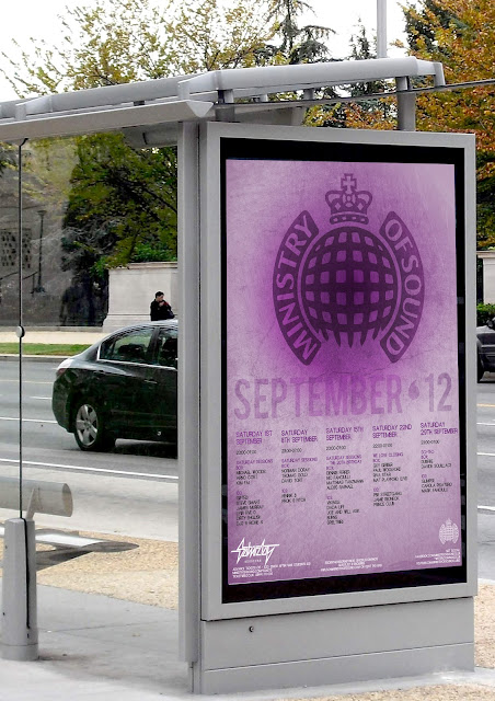
In order to make my portfolio look as good as I can make it and really reflect my personal style I wanted to tweak a couple of my old projects just slightly in order to make them look how I want them as looking back I feel some of my work is not as good as it could be. Rather than completely re-doing my old projects that I'm not 100% happy with I just wanted to tweak fonts or colours or other small elements to improve the final designs.
I began with my Ministry of Sound Saturday Sessions posters, which were designed for a D&AD brief last year.
original designs
edited designs
For these I just edited the layout slightly and changed the colours and fonts as I felt the previous designs weren't working. I prefer the newer designs as they seem much neater and 'trendy', compared to the
originals. They also stand out a lot more with the brighter colours.
If I had more time to work with I would probably have a go at completely re-designing these posters and creating a whole new layout. However, I think these small changes have really improved the original designs and I am much happier to put these into my portfolio.
in situ
in situ


No comments:
Post a Comment