Showing posts with label personal work. Show all posts

Thursday, 21 February 2013

Digital Applications - D&AD It's Nice That

This brief, set by It’s Nice That via D&AD. The brief required a new and exciting ways to stay engaged with their original audience. This could be produced through a poster campaign, a publication, an event, an app or something completely new and innovative. They wanted to spread their commitment to showcasing great work in an information overloaded university world. I wanted to create a poster campaign, which I could use to enter for the brief, as well as use to personally improve my own digital skills.


I created three somewhat similar posters for this brief, each depicting different sceneries. I chose this particular design, as I wanted to take the ‘world’ aspect of their brief and develop it. I like how stylized these designs turned out and feel they appeal to the very wide target audience, which included students, teachers/lecturers, as well as those who don’t know what ‘It’s Nice That’ is. I feel the vector art is quite a broad style and the bright colours throughout help to make the posters stand out. What I would like to further develop is the message its self as this was simply a quote running across the top of each poster. I feel these could be adapted to really promote the message of the company more, however, the fact the posters aren’t too obvious also draw in the attention, and interest, making the audience enquire further.  Throughout this project I improved my skills within Adobe Illustrator, which I had previously lacked beforehand. In particular, I worked mainly with vectors and the appearance palette and felt considerably more comfortable with the programme after the project.


Tuesday, 8 January 2013

Alternative Techniques - Tyneside Coffee Branding


I approached this brief by brain storming a range of different logo designs which I could think of. I did some quick very rough sketches in my sketchbook at first then developed these digitally and experimented with different colour palettes to see which work more successfully. 
I wanted to challenge myself and my skills throughout this brief so I decided to go with a style I don't tend to use throughout many of my projects and that is the very vintage, shabby chic look. 

I chose a pastel colour palette and used vintage imagery such as the detailed birdcage and tree brushes. 


This style created a very calm identity for the coffee shop. I wanted the shop to take on this these as it is almost like it is a small calm area of serenity within the busy city centre.  Like a kind of retreat in the city which you can go to for a relaxing cup of coffee and a snack. The light colour scheme adds to this airy and serene tone. I feel this stands out against other coffee shops with similar logos and darker colour schemes such as Costa and Starbucks which seem to have quite a similar brand identity.

I enjoyed taking this project down a style I would not normally use as at first I immediately thought to go with a style similar to that of Starbucks with a very homely and warm tone. I tried to expand my knowledge with illustrator during this project as I am still not quite comfortable enough with using the programme. I did learn a few more skills throughout and I used this to create my logo when at first I would normally just use photoshop for the majority of my projects. This allowed me to learn about vectors and pixels a little more. However, other than that I didn't utilise the programme as much as I would have liked and still have a lot to learn.


Monday, 12 November 2012

Muffin Break Vouchers

I am currently working part-time at Muffin Break, a coffee shop. As a company we get approached regularly by charities requesting a basket of muffins to give away as a prize for raffles. This sometimes becomes an issue and my boss asked me if I could design a voucher which we could instead give to the winner so they could come in store and receive a free any size coffee and muffin for two. I came up with the following designs:


For these designs I tried to replicate the current, recent graphic design trends within the company with the colour scheme and hand rendered type.


Packaging Design - Urban Outfitters


During this project I began getting to grips with adobe illustrator, which is a programme I'm still not completely confident with as I always tend to use Photoshop throughout my projects. It was a good project to help me teach myself the basics as I approached my designs by creating each face of the box on illustrator, then putting them all together using the warp tools in Photoshop. It taught my the basics of vector shapes and the pathfinder and grouping.

I do like the final outcome of this however I would like to add to this project another time and create more designs using the packaging theme and perhaps make them a little more intricate as I feel this would really reflect urban outfitters as a brand.

This was my first ever packaging brief so my skills werent as good as they perhaps could have been and I have had fun learning new techniques and quite enjoyed the brief as a whole. I would like to work on more packaging brief as I feel there is still a lot more techniques for me to learn and improve on.

Wednesday, 17 October 2012

Packaging Design - Urban Outfitters

My newest brief is to develop and produce a shipping packaging design for one of the following online stores: Phonica Records, NET-A-PORTER/MR-PORTER, Urban Outfitters, Fortnum & Mason or Space NK Apothecary.

The packaging should inform, inspire the imagination and also articulate the nature of the products sold by the company. I am to consider things such as boxes, sleeves, tubes, plastic bags, branded tape/ribbon, envelopes, branded tissue, bubble wrap/other alternative, stickers/ink stampers, and a 'documents enclosed' solution.

After briefly researching a little about each of the different companies I decided to choose Urban Outfitters. This appealed to me most as I am personally interested in the company and I feel I could really have some fun with this particular brief as I love the style of the brand.

I began to tackle the brief by conducting some research. I first found images from a company magazine and took images from the website and of a range of products which they sell. I then went on to research current packaging designs as well as competitor brands and their packaging. A lot of my images I put into my sketchbook and also on my Pintrest account, http://pinterest.com/alisonwaltham.
I continued to carry out research by looking into the brand logos and a range of different typefaces which suit the brand and its personality then dived in to some initial ideas.

Saturday, 15 September 2012

Project Attire


A friend of mine was recently thinking of beginning his own clothing business. Everything is still currently on the drawing board, but he really wanted me to help get things started by designing a logo for him, to give him a little more motivation to get everything going.  I was told the company would begin with selling t-shirts, vests, jumpers and hoodies with various different designs. I thought I would design quite an intricate, aesthetically pleasing logo so the logo its self could be a design for some of the items, maybe large across the middle, or small in an upper left corner of the apparel. As well as the logo being pleasing to look at, I also wanted to follow trends and still reflect the brand personality. My personal favourite logo is the circular one wiht the zig-zag outside border.

Tuesday, 27 March 2012

Newcastle Medical Photography Department

I was asked to produce some logo ideas for the medical photography department within the Newcastle RVI. The logo had to give the department an identity and stand out so I didnt want to go down the conventional route of images of cameras etc. There were no restrictions on colour or type other than making sure it was legible so I began by doing a bit of research.

I first looked at different parts of a camera so I could incorporate that into the logo rather than just an obvious camera. I also did a little research into photography and aperture.

I then looked mainly at Damien Hirst and his Pharmacy work to get a feel for a style of type and colour.

After my research I began to produce some very rough design ideas on Photoshop of things which just came straight into my head. I also experimented a little with some different layouts, fonts and colours. 

I began to develop these rough ideas further and produced the following designs


Tuesday, 28 February 2012

Typographic and Editorial Design - Ministry Of Sound Brief

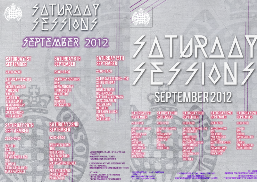
I was given the choice of two different briefs, one provided by Pentagram, the other by Ministry Of Sound, which I chose. The brief was to produce 3, typographical A2 outdoor posters which could be landscape or portrait, that would act as a 3 month advertising campaign for Ministry Of Sound's London event, 'Saturday Sessions'.

I was to communicate a clear, conceptual theme or idea based around the club or music and I could be as literal or as abstract as I wished.

Guidance was given on the logo, content and colour scheme, however, the type choice and size was up to me. I also had to communicate the dates, DJ's and brand very clearly and concisely, therefore the typography should strike a balance between expression, experimentation and legibility. The poster would also be outdoors therefore may often been seen by passers by or moving vehicles therefore impact was key.

My target audience was clubbers and dance music lovers aged around 18-30 years.

I began by researching some designers famous for their typography experimentation, such as David Carson and Andrea Tinnes. I continued my research by then collecting images of exsisting Ministry Of Sound graphics and Saturday Sessions posters and researching designers and companies who had previously designed for Ministry Of Sound such as Pawel Admek, Naju and Studio Output.

After my research I began to design some poster ideas.


MY FINAL DESIGNS


I decided to use these as my final 3 designs and I personally thought out of my designs that these met the brief requirements the most successfully and looked the most interesting. I wanted to keep the same design throughout the 3 posters as this created a link between all three, making the advertising campaign flow. By changing the colour behind the logo this made it easy to associate the different months and posters by their particular colour. 

Wednesday, 25 January 2012

Subeaze - Live Brief

Subeaze is a new sub-contracting company. I was asked to design their logo which included the full url of their website 'subeaze.com'. I designed the logo using a colour scheme which is seen throughout construction graphics such as black, yellow, orange, green etc. I also wanted the logo to be quite masculine and bold again in order to reflect the company and also make it stand out. I designed a few different logos and settled on the following design.
I thought this final design was quite successful, however, it is too obvious and I think a logo which goes further between the lines would be more imaginative and more successful. I could develop this further and play around with shapes in order to make it more individual. 

Tuesday, 17 January 2012

Penguin Books Brief

The brief provided by Penguin Books was to design a new cover for the novel 'One Flew Over The Cuckoo's Nest' in order to refresh the book and appeal to a new generation of readers. It was essential that I approached the design at a fresh angle and avoided the obvious cliche's and steered clear from any promotional film graphics. The audience would be all readers, both familiar and unfamiliar to the text and the cover should be effective on its own, but also work digitally on screen for e-books. 

I began by researching some graphic illustrators in order to help inspire my self. I then continued my research and looked at many different existing book covers and existing covers for the novel its self. Again, from this, I learned what worked most effectively, and also what had already been done, so I could avoid that and be more imaginative and creative with my own designs. 


My first designs are a lot more obvious and cliched, with the use of the metal cell door and the barbed wire fence. Although I thought these looked quite effective, they didnt particularly meet the brief as they specifically stated they wanted to see original, striking and imaginative designs. I then began thinking further and developed the designs with the squares, which represented the madness within the book, arranged as though they are a circling black hole. I settled with this final design as I thought it was aesthetically pleasing and met the brief requirements. 

Friday, 4 November 2011

Branding and Corporate Image #2

'Sync' is a company based around sustainability. The brief was to design a logo for the company which reflected a friendly, open, approachable personality yet also fit in with an educational setting. The logo had to appeal to the public, but also researchers and academics and must include their slogan, 'Sustaining Future Research'. In order to reflect the sustainability of the company I decided to use a lot of greens and blues in my designs. The designs below are those I felt looked the most successful. I wanted to use the idea of a light bulb in the design to reflect the idea generation within the company. I developed this idea further by simplifying the shape of the light bulb into the two circles which I felt helped make the design more original.

Friday, 28 October 2011

Branding and Corporate Image #1

I was given a brief asking to design an identity of the Staff Bistro on the Rye Hill Campus at Newcastle College. The aim was to help promote awareness of the staff only restaurant by designing a logo, stationary and a menu for the bistro. The design I produced had to be modern and stylish with a target audience of all college staff, including executive staff and lecturers. 

Before I began to design I first took time to research branding and logos in order to get an idea of how existing companies and restaurants in particular, communicated their whole company using typefaces, colouring and layouts. I looked in depth at existing, popular logos which helped me to understand which aspects helped to make the logo successful at promoting the company and its personality.
 After my in-depth research I then began to think about my brief and how I could develop an original, successful design using inspiration from the existing companies and logos I had looked into. I settled on the name 'Rye Bistro' as although it may not sound particularly imaginative, I feel the simplicity of it meets the brief. Once my name was decided I then began sketching logos and developing them using Photoshop and producing the following designs:


In the end I settled with the final logo above. I chose this as I thought it fitted the brief guidelines as I feel it can appeal to a large target audience. The colour choice I settled with as it ties in with the scheme of the college therefore making the design fit in successfully. It is also quite simplistic making it recognisable and easily legible and I feel the use of all lower caps gives it a more modern, contemporary feel.