Showing posts with label design agencies. Show all posts

Friday, 1 March 2013

Design agencies I'd love to work with!

SMACK 
“Our secret formula. Work hard, play hard; be bold, stay hungry; and always exceed expectation.”

Smack is a very recently established design agency, only set up on 2012. It stands out to me as an agency I would to love to work with as its founders have a fresh, straight-talking approach to design. Considering the fact the agency its self is only one year old, their client list is extremely impressive, including the likes of Aston Martin and Ebay. I also find the founders themselves inspiring as they created the agency from their own living rooms, before quickly expanding and now working with a strong team of 7. 


PIXELDOT CREATIVE
“The Pixeldot team is formed of great people who know their stuff, not jacks of all trades, but specialists. Individually we’re great, together we’re awesome.”

Pixeldot Creative specialise mainly in branding, an area of graphic design I have a personal interest in, making them an agency I would love to work with. Their work has a very professional and definitive style to it, which is a style which appeals to myself personally. Again, they have a huge list of extremely well known clients and are an extremely successful agency, therefore there would be endless learning opportunites. Not only does the agency and their ethos appeal to me, but their website in general is a huge selling point, with fluid navigation and a stylish layout.


WE MAKE AWESOME SH.IT
“We’re a collective. We’re about the awesome.”

We Make Awesome Sh.it immediately stands out as an agency with its eccentric name. What mainly attracted me to this particular agency was their clients. The majority of their work is for music and televison, both particular interests of my own, especially music. Working within an agency which specialised in my particular interests would be a huge learning curve, as well as extremely enjoyable. Not only that, but again, as an angency, they have a positive ethos and their passion is obvious, which is a large selling point to myself as the general atmosphere and mindset of an agency is just as important as the work they produce. 


Monday, 27 February 2012

Naju

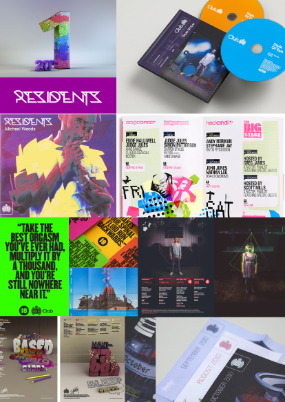
I decided to look into the work of a designer who has previously designed for Ministry of Sound to gain inspiration. Common characteristics I noticed include:
  •  a heavy use of bold, bright colours throughout, which really catch your eye and make the designs aesthetically pleasing. 
  • Fonts used tend to be sans serif, very easily legible and very modern. 
  • A mixture of weights throughout the fonts in order to make certain parts of the image and text stand out more. 
  • A heavy use of geometric shapes which makes the image look futuristic. 
  • Interesting use of mixed media in some designs, more original and imaginative. 
  • Contrast of brighter colours against darker backgrounds which brings certain parts of the image forward. 
  • Basic shapes and colours make the posters easy to read and seem quite simplistic but there is actually a lot more to them such as layers and effects applied. 


Studio Output


I continued my research to gain further inspiration for my Ministry of Sound brief. I decided to look at a design studio which had previously produced work for Saturday Sessions. I noticed a range of certain successful characteristic throughout their designs including:
  • Bright and bold colours. 
  • Bold fonts. 
  • A focus on interesting graphics and images to draw in attention. 
  • Very modern and attracts the target audience successfully. 
  • Interesting use of mixed media and photography. 
  • More detailed, eccentric fonts used in images, then bold and simplistic fonts used throughout the copy which creates a contrast. 

Tuesday, 17 January 2012

Graphic Design Agencies - Illustration

 The designers within the company do tend to have some similarities within their designs, such as a popular use of digital collages,. However, due to the fact there are many different designers within the company means there is also a lot of individual variation. The majority of work produced by these designers is very modern and colourful.

A lot of the particular designs I looked at seem as though they were all completely digitally produced due to the use of basic images and digital collages. However some of the designs also used a lot of photography and were created by printing images or creating models then photographing them then perhaps manipulating that photograph on Photoshop,  producing a similar effect to that created on the Kate Nash CD cover.

I personally like some of the more detailed digital collages as these are very interesting to look at and I like how the rather random combination of images works very effectively.  I also liked the photography work by Chrissie Macdonald which is seen in the Kate Nash cover and the image in the bottom left. This look very effective and individual and I feel it would work well in any graphic work such as posters, book covers, cd covers etc.

The Peepshow Collective is made up of university graduates who wanted to self promote and share clients. They are young adult designers and tend to work for the same audience, with clients including MTV, DC Shoes , Levi’s and Quicksilver, for example. However, they prove to be versatile by also producing successful work for clients such as The Financial Times,  Waitrose etc.  They meet their target audiences well by producing verstile designs which could appeal to anyone. 


There is a wide variation of different styles throughout the different designers and illustrations produced throughout the agency.  There is a lot of more detailed work produced throughout the agency, such as the  movie poster or the image of the bride and groom in the bottom left and which looks almost like a painting or a photograph manipulated on Photoshop.

Due to the different variations of styles there are many different techniques and materials which may have been used throughout the creations of the illustrations. For example it seems many may have been produced using pen and ink then scanned into Photoshop in order to alter colours or brightness or just finish off the image before printing. Then on the other hand it looks as though some of the designs may have been completely digitally produced, such as some of the digital collages, or they may have been again sketched before importing to Illustrator or Photoshop.  The image of the building may have even been a sketch at first, or potentially a  paper cut out.

I like all of the different variations of styles throughout the agency. I feel the hand drawn book cover design looks very interesting and the attention to detail draws in the audience making it a successful cover design.  I also quite like the Clockwork Orange design as I like how minimalist it seems and how the layers of colour and block shapes work together.

Due to the wide range of styles I feel the company works well in producing different illustrations for any audiences. A quote taken from their website - “We specialize in supplying contemporary illustration to clients worldwide. With a wealth of experience, our artists continue to produce excellent work from book illustrations to billboard posters.”