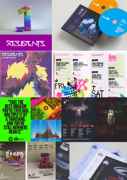
I continued my research to gain further inspiration for my Ministry of Sound brief. I decided to look at a design studio which had previously produced work for Saturday Sessions. I noticed a range of certain successful characteristic throughout their designs including:
- Bright and bold colours.
- Bold fonts.
- A focus on interesting graphics and images to draw in attention.
- Very modern and attracts the target audience successfully.
- Interesting use of mixed media and photography.
- More detailed, eccentric fonts used in images, then bold and simplistic fonts used throughout the copy which creates a contrast.


No comments:
Post a Comment