Tuesday, 27 March 2012

Newcastle Medical Photography Department

I was asked to produce some logo ideas for the medical photography department within the Newcastle RVI. The logo had to give the department an identity and stand out so I didnt want to go down the conventional route of images of cameras etc. There were no restrictions on colour or type other than making sure it was legible so I began by doing a bit of research.

I first looked at different parts of a camera so I could incorporate that into the logo rather than just an obvious camera. I also did a little research into photography and aperture.

I then looked mainly at Damien Hirst and his Pharmacy work to get a feel for a style of type and colour.

After my research I began to produce some very rough design ideas on Photoshop of things which just came straight into my head. I also experimented a little with some different layouts, fonts and colours. 

I began to develop these rough ideas further and produced the following designs


Wednesday, 7 March 2012

Personal Branding

 I began creating my own logo by doing a few rough sketches of some ideas which came straight to mind. I then scanned in some of the rough designs which I liked most and began manipulating them in photoshop to create the logo. The first design features my initials in a swirly, lower case hand written type. I traced this with the pen tool to create a smooth, black line. I then developed this further by incorporating the circle and experimenting with different colour choices. I repeated this process with a different design, the upper case 'AW'. I preferred this design as I thought it looked more effective.


I finally settled on the bottom left design. It is obvious that the letters are 'AW', however, the handwritten type makes it more individual and personal to myself and makes the letters look more interesting. I chose to use the pastel blue colour in my final logo as I personally thought it worked best.

Tuesday, 28 February 2012

Typographic and Editorial Design - Ministry Of Sound Brief

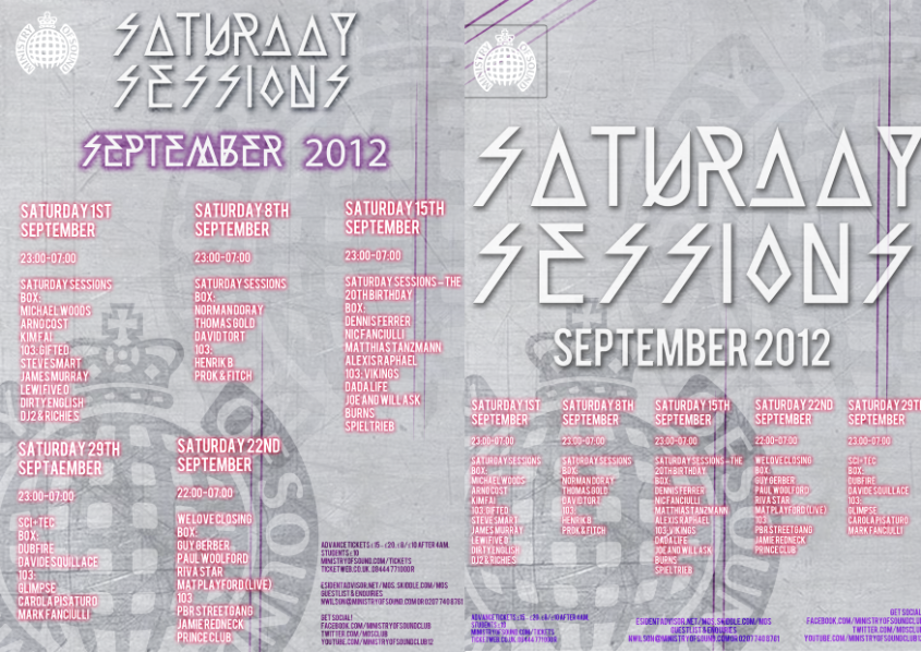
I was given the choice of two different briefs, one provided by Pentagram, the other by Ministry Of Sound, which I chose. The brief was to produce 3, typographical A2 outdoor posters which could be landscape or portrait, that would act as a 3 month advertising campaign for Ministry Of Sound's London event, 'Saturday Sessions'.

I was to communicate a clear, conceptual theme or idea based around the club or music and I could be as literal or as abstract as I wished.

Guidance was given on the logo, content and colour scheme, however, the type choice and size was up to me. I also had to communicate the dates, DJ's and brand very clearly and concisely, therefore the typography should strike a balance between expression, experimentation and legibility. The poster would also be outdoors therefore may often been seen by passers by or moving vehicles therefore impact was key.

My target audience was clubbers and dance music lovers aged around 18-30 years.

I began by researching some designers famous for their typography experimentation, such as David Carson and Andrea Tinnes. I continued my research by then collecting images of exsisting Ministry Of Sound graphics and Saturday Sessions posters and researching designers and companies who had previously designed for Ministry Of Sound such as Pawel Admek, Naju and Studio Output.

After my research I began to design some poster ideas.


MY FINAL DESIGNS


I decided to use these as my final 3 designs and I personally thought out of my designs that these met the brief requirements the most successfully and looked the most interesting. I wanted to keep the same design throughout the 3 posters as this created a link between all three, making the advertising campaign flow. By changing the colour behind the logo this made it easy to associate the different months and posters by their particular colour. 

Monday, 27 February 2012

Pawel Admek

I looked into some of the designs created by Pawel Admek for Ministry of Sounds, Saturday Sessions in order to gain further inspiration. I found common factors included bright and bold colours, plain black/white/grey text which stood out against the bright busy backgrounds. There is an overall modern style to the designs due to the more futuristic fonts used. The posters are also kept quite simple with not too much information therefore making the designs easier to read whilst still getting the point across.