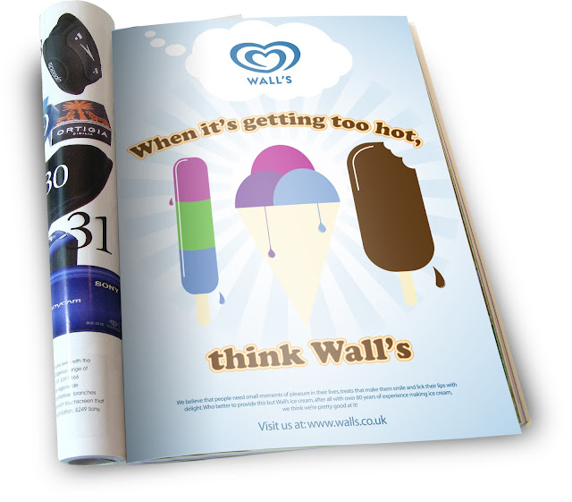
This weeks digital skills session was all about typography styling using adobe illustrator. This involved using skills such as tracking, kerning, 3D options and getting to grips with the appearance palette. This was a very helpful session to me as I was previously quite unfamiliar with the appearance palette. I learned how to add new fills and strokes behind or in front of the text to create the effect shown above. This technique is great for commercial adverts like the one I've designed as it really stands out, as do the bright and bold vector shapes. This also gave me an opportunity to practise my previously learned skills with creating the vector images within illustrator and also placing the image in situ.


No comments:
Post a Comment