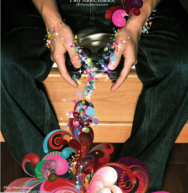
Batista uses a combination of photographs and digital illustration throughout a lot of his designs. This digitalillustration contrasts against the photograph, making it stand out of the image. In addition, Batista uses a lot of bright colours in his work which adds a very light-hearted, positive tone to the image again make the image very striking and bold. I also feel that these designs look very modern due to the fact the images are very digitalised. These kinds of designs I believe seem to work best in advertisements as they are very eye-catching and bold, therefore grabbing the attention of a wide audience, making a successful advertisement.
Perhaps Batista creates his whole images in a combination of Photoshop and illustrator. It seems as though a photograph is taken, then manipulated in Photoshop. The swirl designs would then have been created in illustrator and added to the image and possibly altered a little more in Photoshop again, therefore digitally producing the whole image.
Personally, I think these designs are very effective. I find them interesting and imaginative and I like how he uses this signature style throughout many different pieces yet it still produces a very effective design and works well with any audience.


No comments:
Post a Comment