Thursday, 10 November 2011

Illustrators #3

    MARK WEAVER


Weaver’s style is has a very vintage feel, whilst also being very modern due to the use of digital manipulation. This vintage style is shown in the particular colour schemes,  textures and photograph manipulations he uses throughout his designs.  Weaver uses a mixture of textures, brushes and patterns throughout his designs and created digital collages by layering these with photographic images which produces a very modern feel.

These designs will have been created using digital programmes such as Photoshop and Illustrator as the majority include digital collages. These would have been created by cutting out parts of photographs with the pen tool then possibly editing the photograph in Photoshop to give it a vintage effect. These would then be layered up with other images, text, brushes and textures to create the collage look, and the final image may then be edited to again create the old, vintage look.

I like how Weaver creates these digital collages within his designs.  I believe these look very individual and interesting as the combination of quite random images makes you look longer at the image and makes you think about it more. 

Monday, 7 November 2011

Illustrators #2

    PEDRO VIDOTTO

Vidotto mainly designs film posters. The style throughout all of these designs is very minimalist however work very effectively. Vidotto makes the designs more interesting by reading between the lines and picking out certain symbols which represent the film and are recognisable by all audiences; in particular those who have already seen the film will understand the images he uses.  Vidotto has also added a creased paper texture to these designs which makes the final image a little more individual and interesting, than a plain, basic image would be. Vidotto has also very carefully chosen his colour palettes in these designs in order to stay relevant to the film and its themes and work well with the symbols he has used.  Although the designs seem quite basic, it’s obvious that a lot of thought has gone into the final images.  These designs are very modern and work best as film posters or book covers as they pick out a particular symbol to represent them which works very effectively.

These designs are quite simple and it is possible that they have been created completely in a digital programme such as Illustrator as all of the lines and shapes are very crisp and precise. However, they may have also been originally sketched out then traced and manipulated in Photoshop or Illustrator afterwards in order to create that very crisp feel.

I like how these designs seem quite basic, yet are very effective due to the imaginative images used to represent the film.  I also like how there are no outlines to the images, this makes the designs look more original, bold and keeps the design looking less like an obvious cliché. 

Sunday, 6 November 2011

Illustrators #1

    ADHEMAS BATISTA


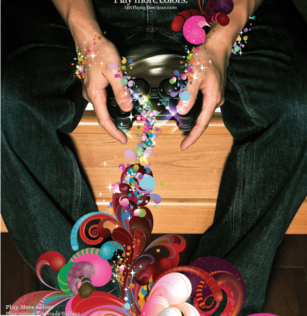
Batista uses a combination of photographs and digital illustration throughout a lot of his designs. This digitalillustration contrasts against the photograph, making it stand out of the image. In addition, Batista uses a lot of bright colours in his work which adds a very light-hearted, positive tone to the image again make the image very striking and bold. I also feel that these designs look very modern due to the fact the images are very digitalised.  These kinds of designs I believe seem to work best in advertisements as they are very eye-catching and bold, therefore grabbing the attention of a wide audience, making a successful advertisement.

Perhaps Batista creates his whole images in a combination of Photoshop and illustrator. It seems as though a photograph is taken, then manipulated in Photoshop. The swirl designs would then have been created in illustrator and added to the image and possibly altered a little more in Photoshop again, therefore digitally producing the whole image. 

Personally, I think these designs are very effective. I find them interesting and imaginative and I like how he uses this  signature style throughout many different pieces yet it still produces a very effective design and works well  with any audience. 

Friday, 4 November 2011

Branding and Corporate Image #2

'Sync' is a company based around sustainability. The brief was to design a logo for the company which reflected a friendly, open, approachable personality yet also fit in with an educational setting. The logo had to appeal to the public, but also researchers and academics and must include their slogan, 'Sustaining Future Research'. In order to reflect the sustainability of the company I decided to use a lot of greens and blues in my designs. The designs below are those I felt looked the most successful. I wanted to use the idea of a light bulb in the design to reflect the idea generation within the company. I developed this idea further by simplifying the shape of the light bulb into the two circles which I felt helped make the design more original.