Tuesday, 26 March 2013

Portfolio Production - Re-working

In order to make my portfolio look as good as I can make it and really reflect my personal style I wanted to tweak a couple of my old projects just slightly in order to make them look how I want them as looking back I feel some of my work is not as good as it could be. Rather than completely re-doing my old projects that I'm not 100% happy with I just wanted to tweak fonts or colours or other small elements to improve the final designs.

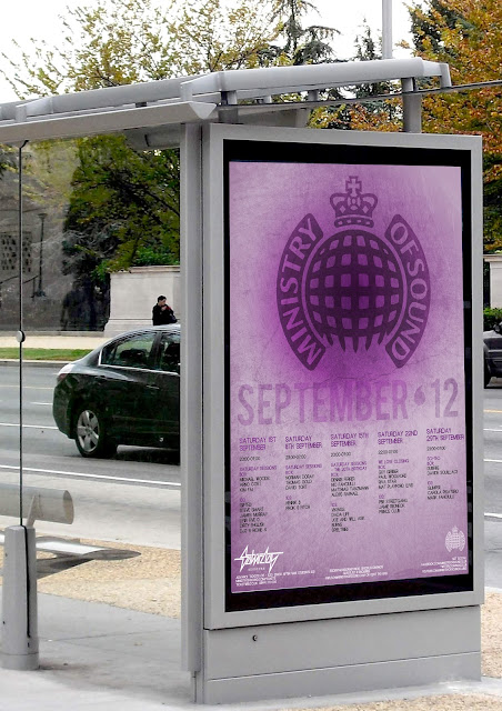
I began with my Ministry of Sound Saturday Sessions posters, which were designed for a D&AD brief last year.

original designs

edited designs

For these I just edited the layout slightly and changed the colours and fonts as I felt the previous designs weren't working. I prefer the newer designs as they seem much neater and 'trendy', compared to the
originals. They also stand out a lot more with the brighter colours.
If I had more time to work with I would probably have a go at completely re-designing these posters and creating a whole new layout. However, I think these small changes have really improved the original designs and I am much happier to put these into my portfolio.

in situ

in situ

Monday, 25 March 2013

Work Based Learning - Durham Fashion Week


The final design I chose for my Durham Fashion Week project was a mixture of all the styles I experimented with. I used a high fashion image and a very stylish logo which I felt met the brief requiirements. I added texture and expermented with the levels and effects of the photograph in order to give a slight grungy look to the overall poster, making it stand out and also keeping it in trend. I also cut up the image to create an almost collage-like effect, which also added to the grungy tone, without taking away the high fashion and stylish effect,  I feel the overall poster design is very modern and meets the brief requirments most out of all of my designs. I kept this sleek look throughout the website designs, making the main focus the fashion photography. I also designed two landing pages one male and one female, which again makes the designs more gender neutral, rather than focusing mainly on women. 

Friday, 22 March 2013

Current Time Plan


In order to try and stay as organised as possible in the run up to my final hand in I've created an overall time plan of everything I need to do and when it needs to be done by.

PPD:  Keeping this blog up to date, as well as creating my creative CV, business cards and a cover letter. As well as this I need to identify opportunities and requirements in future employment, continuing education, competitions and festival submissions.

WBL: Placement work and evaluations, time sheets (typed and formatted), work related presentation (analysis of sector worked in , discuss roles in the agency, dealing with clients, pitching, time sheets etc) and a written skills analysis (knowledge gained about the industry and skills gained.).

Portfolio Production: Putting together and presenting all finalised work from the past two years as well as any successful WBL work (magazine spreads, durham fashion week and placement work). As well as this I need to produce written documentation of tutorials and advice given and an evaluation of my portfolio, analysing each individual project.

Work Based Learning - Magazine Spreads

This was a very open brief. I was asked to design two; double page spreads for a magazine of my choice. I chose to design for a music magazine due to my personal interests; throughout this brief I wanted to really improve my editorial skills within magazine layout design, as this was an aspect of design I am yet to explore. 


I considerably improved my skills within Adobe InDesign, and working with grids and general layout design, which proved very interesting. Both designs have a very abstract and geometric theme and work well with the white space. I edited photography to use throughout my designs in order to add my own personal twist and make the final layouts aesthetically pleasing. This brief improved my skills in all area throughout graphic design, including programme and thinking outside the box.

Portfolio Production

I am now onto my last module for the year which is all about creating the best portfolio I can and preparing for my final show.
I plan on tweaking some of my older designs which are currently in my portfolio so I am completely happy them, then adding whatever is missing.
After looking through my portfolio with my tutors I decided I wanted to do more work on editorial, in particular, magazine spreads. I was given a brief which was to design 2, double page spreads for a magazine of my choice, in which I chose a music magazine.
Alongside this brief I am also keeping my blog up to date and will be taking part in a two-week work placement which will go towards my work based learning module.
As well as my magazine spreads I also want to try and complete another live brief. The current two briefs I am looking into are:

Maha's Classics by Saira
-An independent fashion brand that fuses Pakistan dress, luxurious fabrics and detailed hand embellishments with contempary Western styling.
-Complete branding solution required for business cards, letterheads, websites and brochures.
Deliverables 
-2x logo submissions
- Business Cards
- Letterheads
- Generic flyer

Durham Fashion Week
- 1 week event in October with 18-50 y/o target audience. Range of events throughout the week.
- Design a slick/stylish logo, not too feminine and no pink. Shouldn't look out of place in 'Tatler Fashion Magazine'.
Deliverables
- 2x Durham Fashion Week logo routes
- 1 Web page front design
- 1 A2 promotional poster

Seb Lester Visits

Today we we're given the pleasure of a lecture from the well-known type designer and calligraphic artist, Sebastien Lester. Lester gave us an insight on his life growing up and discussed how he got involved in the industry and how he got to where he is today. 

Lester has worked with a whole range of huge brands such as The Rolling Stones Magazine, Intel, Waitrose, The Daily Telegraph, British Airways, Barclays, H & M, Ariel, The Labour Party, the list goes on and on. 

Lester discussed how as soon as he picked up a pen and began designing his first type he has never lost his passion and any second of the day he has spare he will be working on his projects. A lot of his inspiration came from his personal interests such as BMX'ing and sci-fi, as well as the famous Neville Brody. As well as working on his type design he also began to teach himself motion graphics and animation, in order to give him the ability to bring life into his designs and experiment with moving type. 


HAMBURGE - Typeface used by British Airways


NEO SANS - Extremely popular typeface used throughout many big brands including the Labour Party and Ariel. 


SOHO - Seen throughout GQ branding and the New Scientist.


Iconic design for Penguin Books


More recent calligraphic work

Lester mainly works now on more detailed letter forms and gives them his personal, contemporary twist. 

The talk its self was very inspiring and would have given even those without an interest in design, the urge to sit and experiment with calligraphy and start experimenting in typography.
Typography has more recently become an interest of mine so the talk was extremely informing and inspiring and certainly gave me a lot more motivation. 


Wednesday, 20 March 2013

UCAS Experience - Applying for BA Hons Graphic Design

I have decided to continue with my degree next year and top it up in order to achieve a BA Hons in Graphic Design.
I recently applied 5 universities in which I would like to attend for this particular course. After doing my research I settled on; Manchester Metropolitan, Sheffield Hallam, Leeds College of Art, Nottingham Trent and York College. I intend on entering at either year 2 or 3 of the course, as the extra year would help me to settle into a new city.

After attending all of my interviews I received all conditional offers, however, when I applied I had mistakenly entered point of entry 1, instead of 2 or 3.
Due to this mistake in my UCAS, I was unable to accept any of my offers as I would have been starting at year 1, instead of year 2 or 3 and I wouldn't be funded.

I then went on to apply through UCAS Extra, with the correct point of entry of year 2 at Salford University. I have been asked to attend an interview on 17th April, so fingers crossed!

I intend to complete my degree in a new city, in order to help me gain a little more experience and also give me the opportunity to visit a different place and hopefully a whole range of design agencies and organise summer placements which could in turn lead to potential career opportunities.

Monday, 18 March 2013

Moleskine Scans

I've recently been increasingly more interested in typography and hand rendered type. I'm planning on developing my previous Baz Lurhmann 'Wear Sunscreen' posters and using hand rendered type with them so I have been doing a little bit of rough practise in my moleskin whenever I've got a spare moment! Here are a couple I've been doing:


Friday, 15 March 2013

Inspiration - Hub


Today I went for a wander around Newcastle's Quayside on a mission to try and locate my placement which I will be starting in 3 weeks time at The Point. On my travels I came across this bike shop/cafe and their branding really caught my eye. I really liked the typography on the side of the building and the slight hand rendered style to the lettering as the lines weren't perfectly straight and it gave a really nice touch. The black and white really stood out, especially against the bland and boring buildings surrounding it. The overall design is really quite simple but works extremely well and gave quite a friendly personality. Unfortunately though, it was shut so I couldn't go in and have a nosey at their interior graphics! 

Saturday, 9 March 2013

Wear Sunscreen

This was a self initiated project I am currently working on based on the popular 1999 single by Baz Lurhmann, 'Everybody's Free (To Wear Sunscreen)'. The song is based on an article written by Mary Schmich and features a range of positive, feel good quotes, which anyone can interpret in their own personal way. I love some of the quotes throughout this song and wanted something to put up on my walls featuring these quotes. Typography is something I don't have a lot of experience with and really wanted to explore further, especially throughout this project. It is noticeable that my typography skills are not excellent but I really enjoyed experimenting with a range of different fonts. I would also like to develop these further and create some of my own hand drawn type, which will be a lot trickier but a skill I would really like to develop. 
This is still working progress and I would like to take all of these designs further but so far I am happy with the outcomes. 


I wanted to keep my designs fairly simple, with all of the attention on the quote itself. I did this by using bold, flat colours, with a slight radial gradient to draw the attention inwards. I added some paper textures as this is a technique I personally love using as it always adds that little more to the final design and makes it less boring and flat. I tried to be very selective with my font choices in order to almost reflect the word with the chosen fonts, whilst also making them flow well together. The off-white/beige colour used in the border and fonts again just blend with the central colours better than a plain bold white would and works quite effectively. The more pastel colours give a softer feel and seem to work well together as a poster series. 

In order to take this project further I plan on designing some hand rendered type and digitalising it to make it look a lot more interesting and professional. I have recently become really interested in hand rendered typography and am keen to create my own designs. I think this style would really improve these current designs. 

Personal Branding

I always find it hard to please myself when it comes to my personal branding. Anything I design I always find myself not quite liking and always feel theres something I could change or develop. I've gone through a few different designs in the past and have settled, for the moment anyway, on one particular design, finally! 

Something about this logo wasn't quite right. I really liked the colour, and shape, however it didnt seem quite eye-catching and individual enough. I did like the personal touch of my hand writing, however the design just wasn't 'me' enough, which obviously it should be!
This was a lot more of a sleek design, and has a much more of a corporate feel to it that the previous one. I kept the colour which I liked, and the flow of the letters, however, again, I didn't feel it reflected my personality enough, and almost had quite a boring feel to it, which is not a way I want to represent myself or my designs!  


My current logo is the one above. I went back to the circle shape as I feel this is very versatile and can be put into anything, be it different colours, or textures, etc. I personalised it by creating it solely using the pen tool on illustrator to create a flowing feel with my initials, something which ended up taking way more time than I anticipated! Unlike the others this was produced using illustrator so it is a vector, which is much more suitable for a logo. I went with a different pastel colour just to change it up a bit, but again it could fit with almost anything, but as purple is my own favourite colour it again adds that little bit more personality.

Friday, 1 March 2013

Design agencies I'd love to work with!

SMACK 
“Our secret formula. Work hard, play hard; be bold, stay hungry; and always exceed expectation.”

Smack is a very recently established design agency, only set up on 2012. It stands out to me as an agency I would to love to work with as its founders have a fresh, straight-talking approach to design. Considering the fact the agency its self is only one year old, their client list is extremely impressive, including the likes of Aston Martin and Ebay. I also find the founders themselves inspiring as they created the agency from their own living rooms, before quickly expanding and now working with a strong team of 7. 


PIXELDOT CREATIVE
“The Pixeldot team is formed of great people who know their stuff, not jacks of all trades, but specialists. Individually we’re great, together we’re awesome.”

Pixeldot Creative specialise mainly in branding, an area of graphic design I have a personal interest in, making them an agency I would love to work with. Their work has a very professional and definitive style to it, which is a style which appeals to myself personally. Again, they have a huge list of extremely well known clients and are an extremely successful agency, therefore there would be endless learning opportunites. Not only does the agency and their ethos appeal to me, but their website in general is a huge selling point, with fluid navigation and a stylish layout.


WE MAKE AWESOME SH.IT
“We’re a collective. We’re about the awesome.”

We Make Awesome Sh.it immediately stands out as an agency with its eccentric name. What mainly attracted me to this particular agency was their clients. The majority of their work is for music and televison, both particular interests of my own, especially music. Working within an agency which specialised in my particular interests would be a huge learning curve, as well as extremely enjoyable. Not only that, but again, as an angency, they have a positive ethos and their passion is obvious, which is a large selling point to myself as the general atmosphere and mindset of an agency is just as important as the work they produce.