Thursday 21 February 2013

Digital Applications - D&AD It's Nice That

This brief, set by It’s Nice That via D&AD. The brief required a new and exciting ways to stay engaged with their original audience. This could be produced through a poster campaign, a publication, an event, an app or something completely new and innovative. They wanted to spread their commitment to showcasing great work in an information overloaded university world. I wanted to create a poster campaign, which I could use to enter for the brief, as well as use to personally improve my own digital skills.


I created three somewhat similar posters for this brief, each depicting different sceneries. I chose this particular design, as I wanted to take the ‘world’ aspect of their brief and develop it. I like how stylized these designs turned out and feel they appeal to the very wide target audience, which included students, teachers/lecturers, as well as those who don’t know what ‘It’s Nice That’ is. I feel the vector art is quite a broad style and the bright colours throughout help to make the posters stand out. What I would like to further develop is the message its self as this was simply a quote running across the top of each poster. I feel these could be adapted to really promote the message of the company more, however, the fact the posters aren’t too obvious also draw in the attention, and interest, making the audience enquire further.  Throughout this project I improved my skills within Adobe Illustrator, which I had previously lacked beforehand. In particular, I worked mainly with vectors and the appearance palette and felt considerably more comfortable with the programme after the project.


Wednesday 13 February 2013

Digital Applications - Roberto Perrino


Roberto Perrino is a graphic designer specialising in advertising and print design. One of his main influences in music and his portfolio features a lot of music related event posters, which have a style I personally feel is very aesthetically pleasing. 

There is a heavy use of typography throughout a lot of Perrino's poster designs, again, similarly to Sebatsian Nikolaou, Perrino tends to use a lot of sans serif, bold fonts, simliar to the likes of Bebas. 

There is a heavy use of textures and gradients and light effects to draw the eye into the centre, throughout Perrino's work which I feel are little touches which really finish off the final designs. I feel these techniques work most effectively in the `blue exhibition' and the `mountains beyond mountains' posters. He also tends to use darker colour palettes throughout his designs which are also very effective as they are very bold and always work well together. For example, in the  `mountains beyond mountains' poster, it has a very simple brown and neutral colour palette, however with the imagery, gradients and textures this rather simplistic colour palette still works very effectively and the design is most certainly interesting to look at. Again, smaller touches such as the second `mountains' actually being behind the image of the mountain, really shows that a lot has thought has been put into what the most effective layout would be. 

Digital Applications - Sebastien Nikolaou


Sebastien Nikolaou is a graphic designer with a focus mainly into illustration and typography. I personally like how his colour palettes always seem very effective, with colours complementing eachother in all of his designs. 

A lot of Nikolaou's work tends to feature collages. I like this effect of layering up many different textures images and shapes and is a technique I have always wanted to improve on personally. For example in his `grmin!' peice there is a combination of mixed media and shapes, all layered up in the centre, against a neutral, blank background, which effectivlely draws the eyes attention.

Typography is another heavy feature in Nikolaou's work. The majority of his fonts tend to be very bold and the majority of the time sans serif. He creates an interesting and bold effect by using contrasting colours. Or, for example in his `tonic' poster, he has used both gradients and individiual coloured backgrounds behinds each peice of text in order to draw the eye to the bolder artist names. I personally like the effect all of the gradients create in this image, as well as again the collage style with many vector shapes all built up behind the main image. Again, the texture just finishes off the image, giving it a less flat and plain feel.

 Another effective technique is that used in his `Animals' image, where the colours of the image behind are the fill of the text, only darker, which brings the text forwards and makes it stand out, rather than blend into the background. 


Digital Applications - Research and Inspiration


I began my research by gathering together a range of inspirational posters which I personally like the the look of and the techniques used throughout. I want my design to be quite typographically focused therefore I looked into a range of posters with similar intentions. This is a way for me to get my ideas and motivation flowing and to help me decide which kinds of routes I would like to go down with my designs. Again, I must keep in mind the skills and techniques learned throughout my digital skills lectures therefore I can combine those with the inspiration from these posters and begin to create some initial ideas for my designs.

Monday 11 February 2013

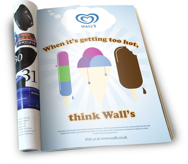
Digital Skills - Walls Ad


This weeks digital skills session was all about typography styling using adobe illustrator. This involved using skills such as tracking, kerning, 3D options and getting to grips with the appearance palette. This was a very helpful session to me as I was previously quite unfamiliar with the appearance palette. I learned how to add new fills and strokes behind or in front of the text to create the effect shown above. This technique is great for commercial adverts like the one I've designed as it really stands out, as do the bright and bold vector shapes. This also gave me an opportunity to practise my previously learned skills with creating the vector images within illustrator and also placing the image in situ.

Monday 4 February 2013

Digital Skills - Blackberry Ad


This weeks digital skills focused on the shapes tool, pathfinder within illustrator and the transform options within photoshop. Working with vectors is not a strong point of mine so I enjoyed getting to grips with them throughout this tutorial and learning more about the pathfinder tool. Learning these skills is making me a lot more comfortable using illustrator and are very simple yet effective skills for creating some very successful designs. Once I had finished my design in illustrator I then put it in situ using photoshop and learned some new techniques such as adding the gradient shadow and the sheen effect to make it look much more realistic.