Tuesday 28 February 2012

Typographic and Editorial Design - Ministry Of Sound Brief

I was given the choice of two different briefs, one provided by Pentagram, the other by Ministry Of Sound, which I chose. The brief was to produce 3, typographical A2 outdoor posters which could be landscape or portrait, that would act as a 3 month advertising campaign for Ministry Of Sound's London event, 'Saturday Sessions'.

I was to communicate a clear, conceptual theme or idea based around the club or music and I could be as literal or as abstract as I wished.

Guidance was given on the logo, content and colour scheme, however, the type choice and size was up to me. I also had to communicate the dates, DJ's and brand very clearly and concisely, therefore the typography should strike a balance between expression, experimentation and legibility. The poster would also be outdoors therefore may often been seen by passers by or moving vehicles therefore impact was key.

My target audience was clubbers and dance music lovers aged around 18-30 years.

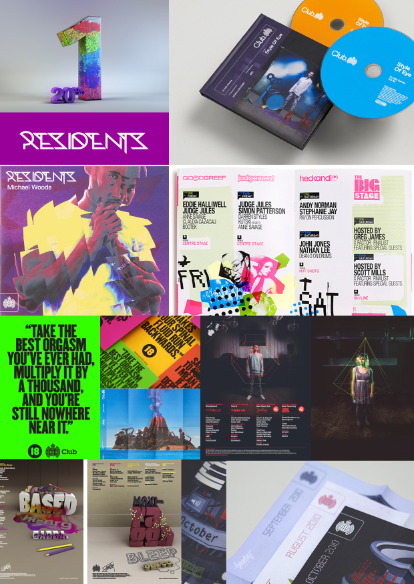
I began by researching some designers famous for their typography experimentation, such as David Carson and Andrea Tinnes. I continued my research by then collecting images of exsisting Ministry Of Sound graphics and Saturday Sessions posters and researching designers and companies who had previously designed for Ministry Of Sound such as Pawel Admek, Naju and Studio Output.

After my research I began to design some poster ideas.
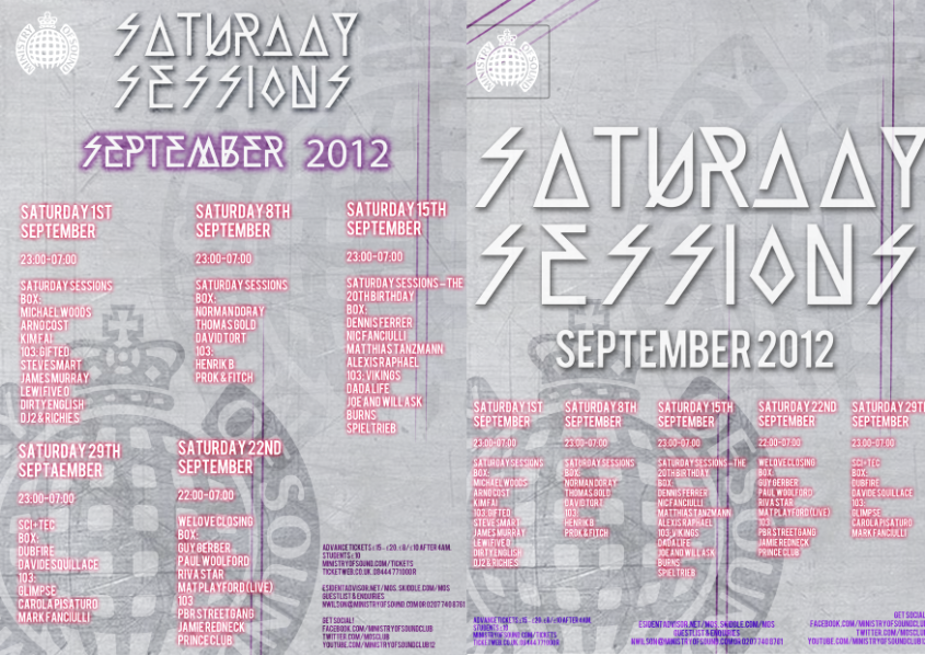


MY FINAL DESIGNS


I decided to use these as my final 3 designs and I personally thought out of my designs that these met the brief requirements the most successfully and looked the most interesting. I wanted to keep the same design throughout the 3 posters as this created a link between all three, making the advertising campaign flow. By changing the colour behind the logo this made it easy to associate the different months and posters by their particular colour. 

Monday 27 February 2012

Pawel Admek

I looked into some of the designs created by Pawel Admek for Ministry of Sounds, Saturday Sessions in order to gain further inspiration. I found common factors included bright and bold colours, plain black/white/grey text which stood out against the bright busy backgrounds. There is an overall modern style to the designs due to the more futuristic fonts used. The posters are also kept quite simple with not too much information therefore making the designs easier to read whilst still getting the point across. 

Naju

I decided to look into the work of a designer who has previously designed for Ministry of Sound to gain inspiration. Common characteristics I noticed include:
  •  a heavy use of bold, bright colours throughout, which really catch your eye and make the designs aesthetically pleasing. 
  • Fonts used tend to be sans serif, very easily legible and very modern. 
  • A mixture of weights throughout the fonts in order to make certain parts of the image and text stand out more. 
  • A heavy use of geometric shapes which makes the image look futuristic. 
  • Interesting use of mixed media in some designs, more original and imaginative. 
  • Contrast of brighter colours against darker backgrounds which brings certain parts of the image forward. 
  • Basic shapes and colours make the posters easy to read and seem quite simplistic but there is actually a lot more to them such as layers and effects applied. 


Studio Output


I continued my research to gain further inspiration for my Ministry of Sound brief. I decided to look at a design studio which had previously produced work for Saturday Sessions. I noticed a range of certain successful characteristic throughout their designs including:
  • Bright and bold colours. 
  • Bold fonts. 
  • A focus on interesting graphics and images to draw in attention. 
  • Very modern and attracts the target audience successfully. 
  • Interesting use of mixed media and photography. 
  • More detailed, eccentric fonts used in images, then bold and simplistic fonts used throughout the copy which creates a contrast. 

Sunday 26 February 2012

David Carson


  • Perhaps one of the most influential graphic designers of the 1990s
  • Best known for his innovative magazine design and experimental use of typography.
  • Broke traditional mould of simple type by making the point that letters on a page are art. 
  • Signature style uses "dirty" type combined with non-mainstream photographic techniques. 
  • Experiments with a range of sizes, alignments, fonts, colours etc. 
  • Work produced for Quicksilver in 2011 uses a range of bright colours, bold, large, eye-catching fonts, hand rendered illustration and photography. Reflects the target audience well, however completely different to a lot of his other work which is a lot simpler, yet just as aesthetically pleasing. For example, in his designs created for an exhibition where he has simply combined photography with a much simpler, smaller type and again, in some, has included some basic hand rendered illustration.
  • Carson claims his work is "subjective, personal and very self indulgent". 
  • Carson takes photography and manipulated and twists them together and sometimes confuses the message. This technique draws in the eyes of the viewer and in turn makes them look deeper into the composition.

Andrea Tinnes


  • Andrea Tinnes created her independent one-woman studio 'typecuts' to promote her own fonts. 
  • The ‘typecuts’ font library consists of a wide range of typographic forms, including text faces over graphic fonts and also dingbat illustrations. The typefaces Tinnes designs seek to explore the relation between geometric construction and also more playful decorative form while also considering historical contexts as well as contemporary tendencies in typedesign